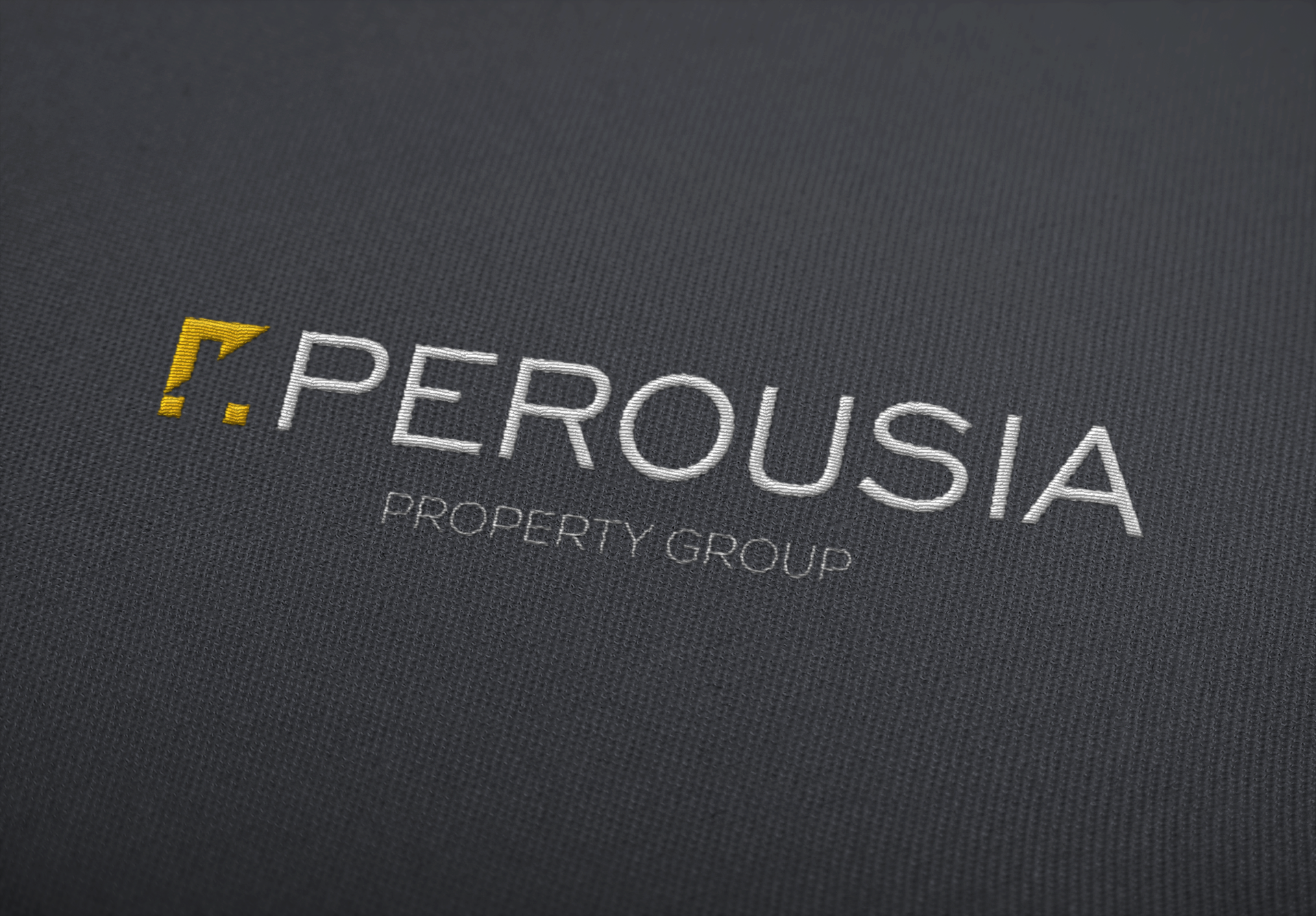
Perousia Property Group commissioned me to do the logo and branding for their new property business!
Join me on my design journey...
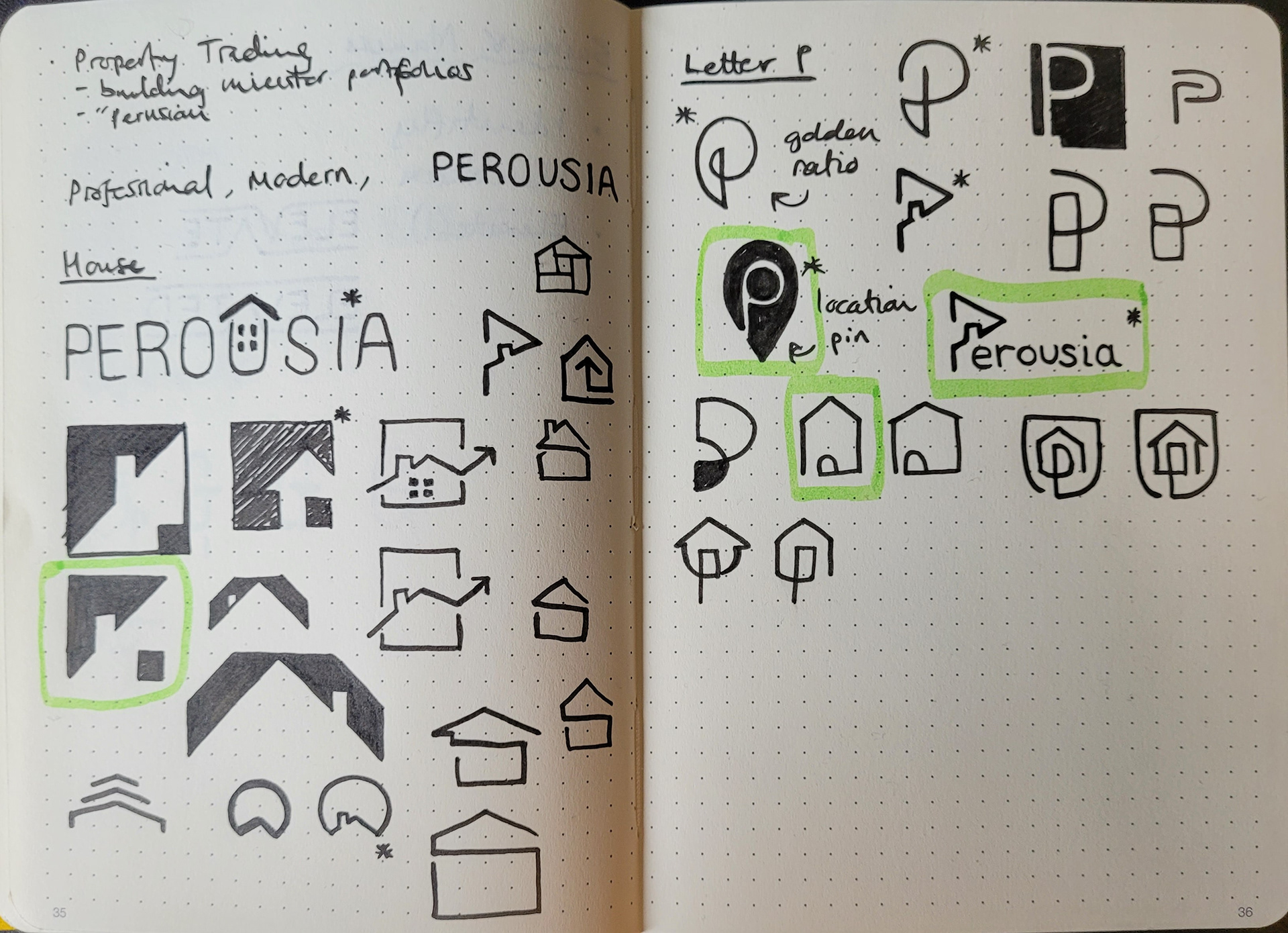
^^ Every project begins with the sketchbook, a place to make mistakes and hopefully a little progress. Inspiration requires dedication and reflection.
✍(◔◡◔)

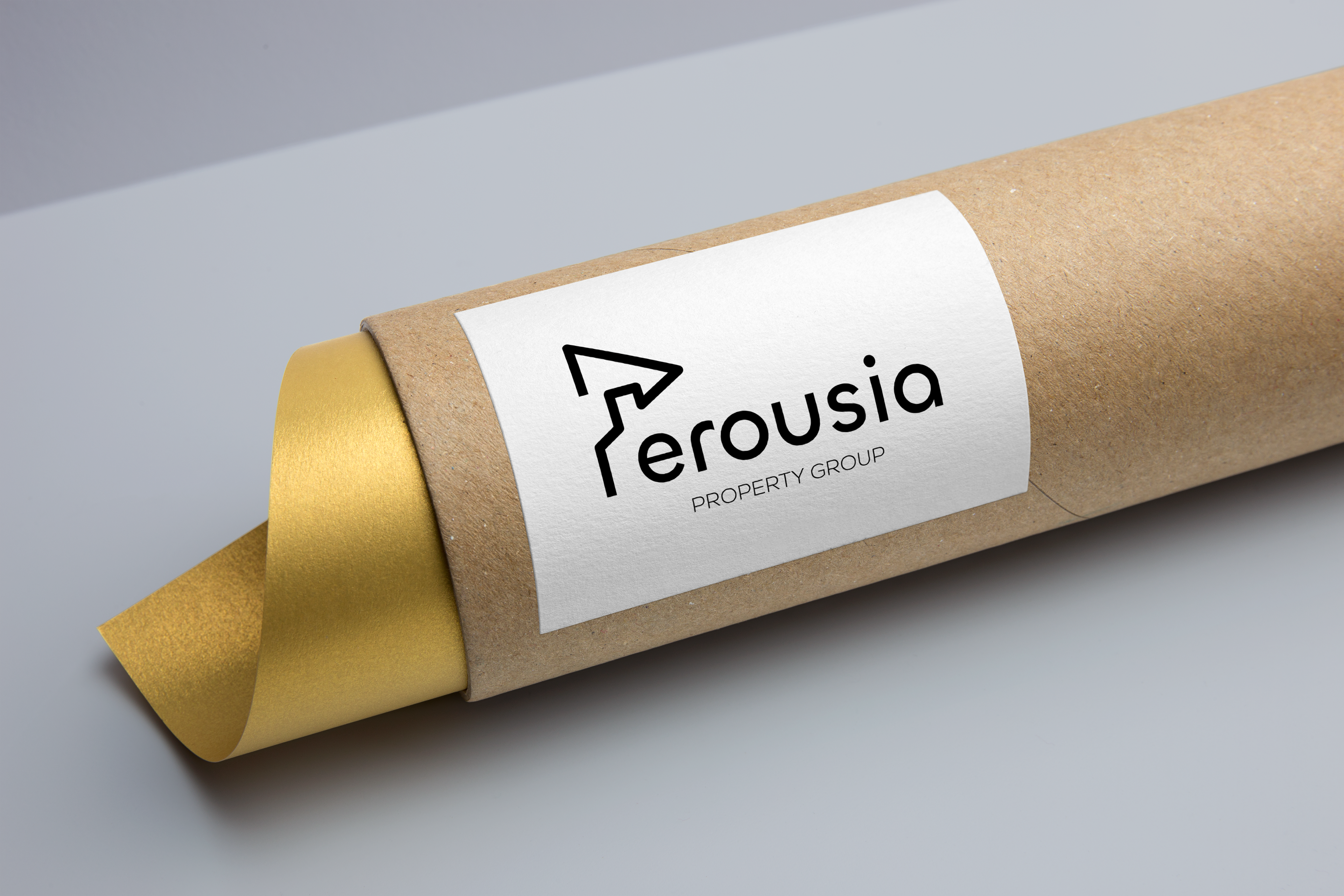
^^ After some sketching, it's time to bring some of my favourite ideas to the screen.
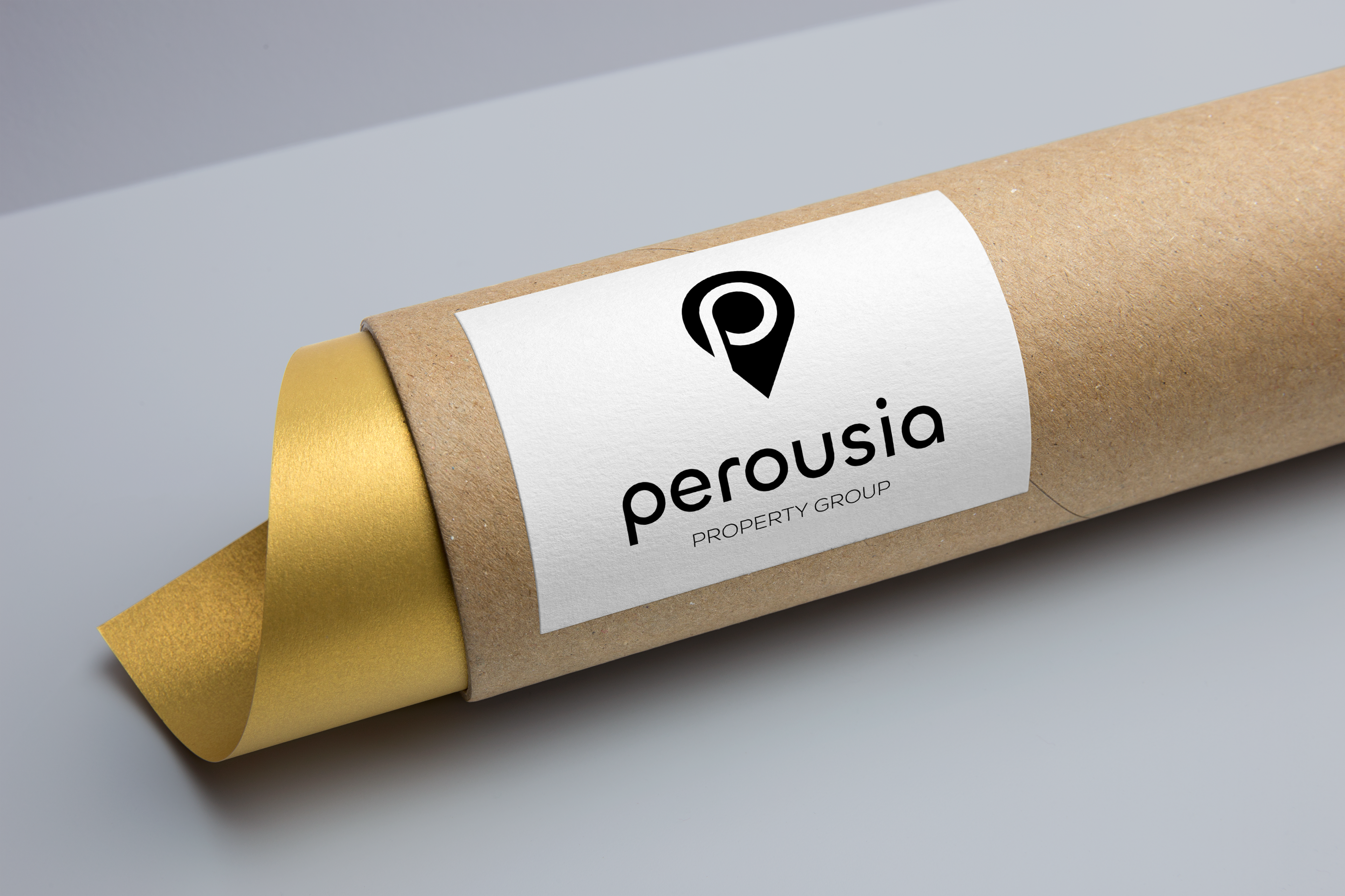
At this stage, the location pin design was a little too close to the Pinterest logo, so we set this design aside.
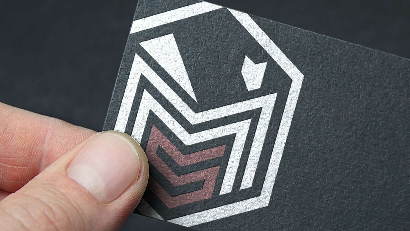
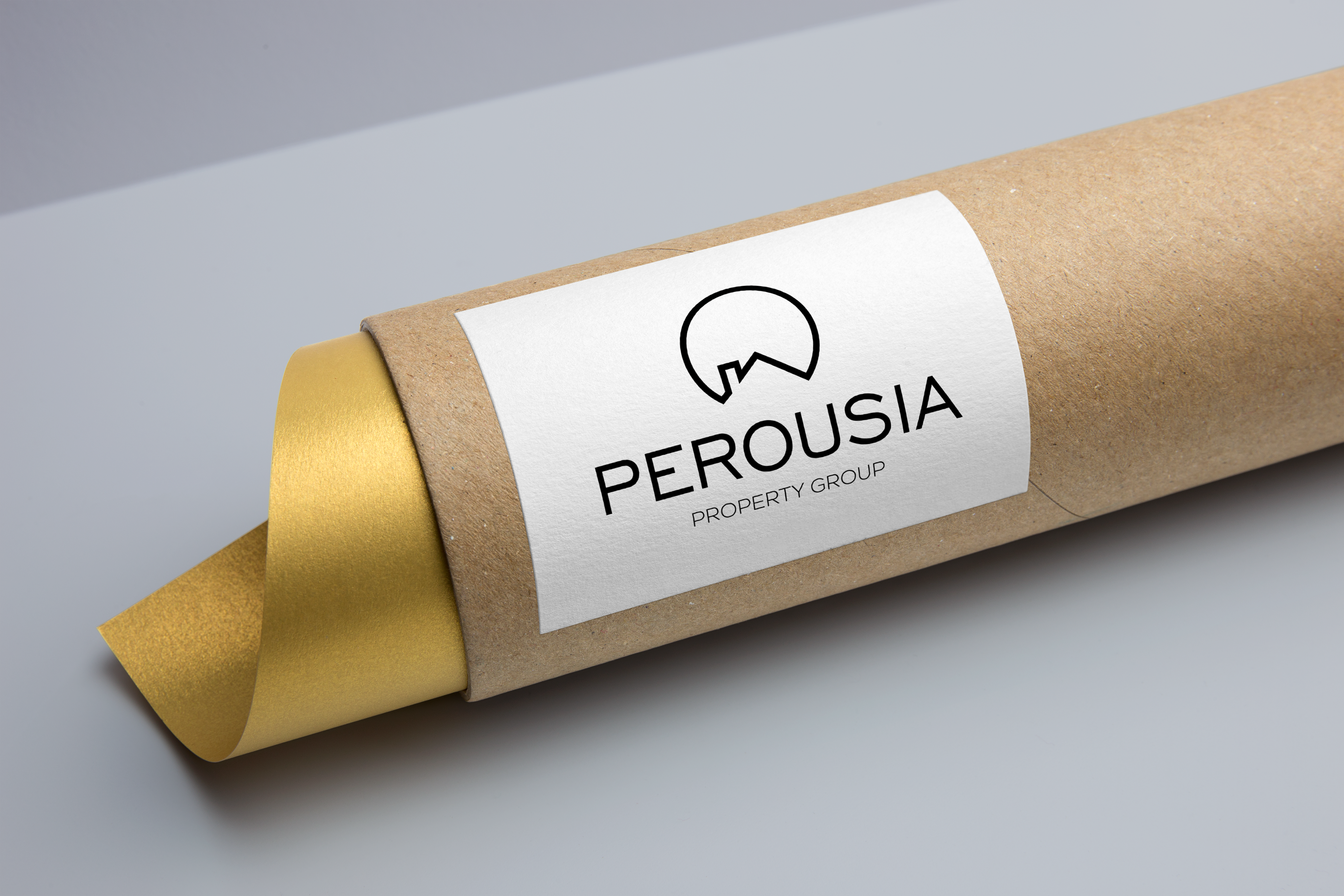
^^ This abstract design really caught the client's eye, however they wanted to make the house element more visible.
Here you can see my simple solution. All it took to increase the logo readability was the addition of one more square to make the corner of the roof and complete the image of a home.
^^ While the client really loved the colour scheme with yellow accents, they decided they required a logo more connected to the Greek origins of their company name...
(◑.◑)
PEROUSIA
A variation on the Greek term "Parousia", meaning "Arrival", which refers to the second coming of Christ.
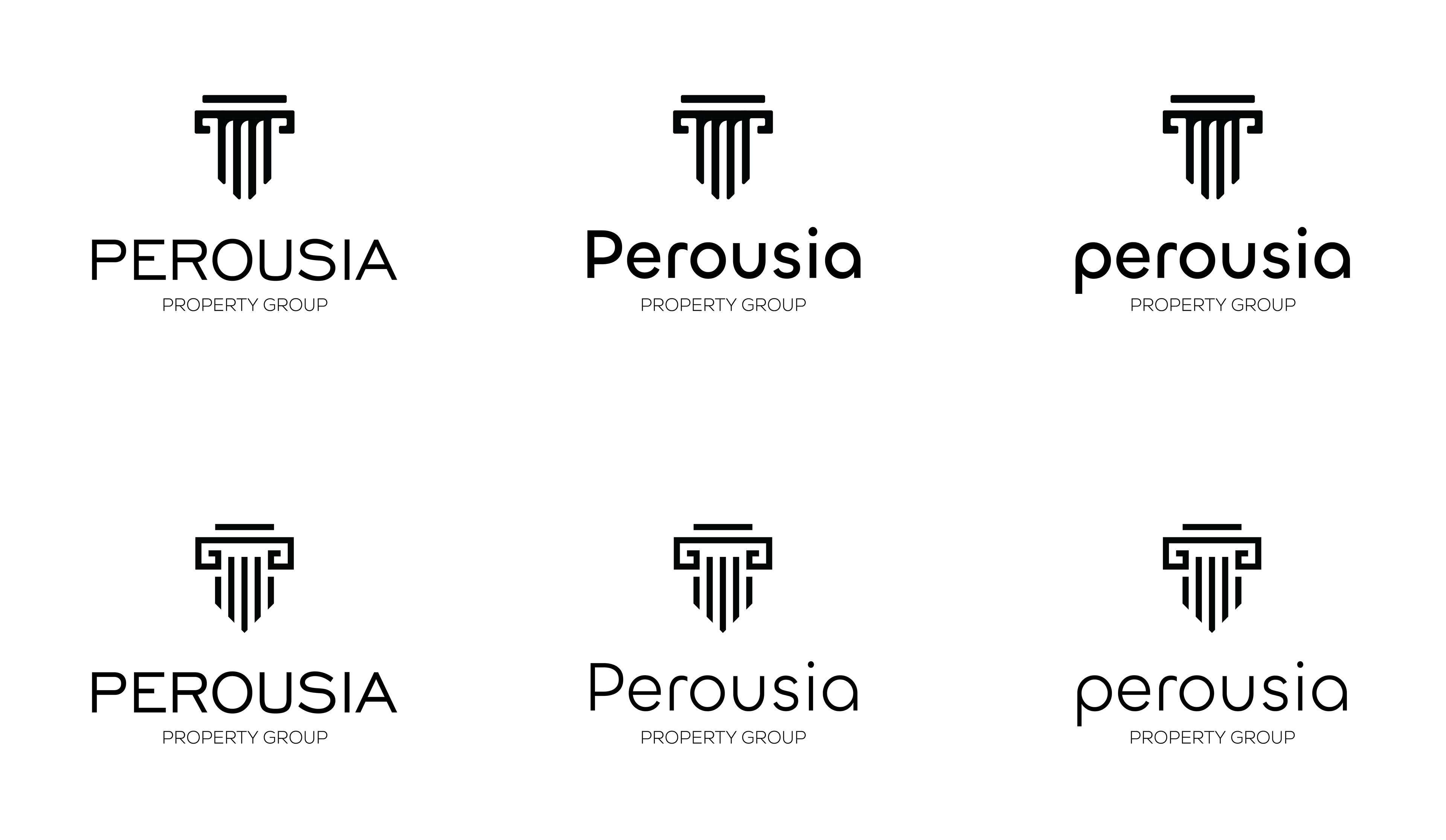
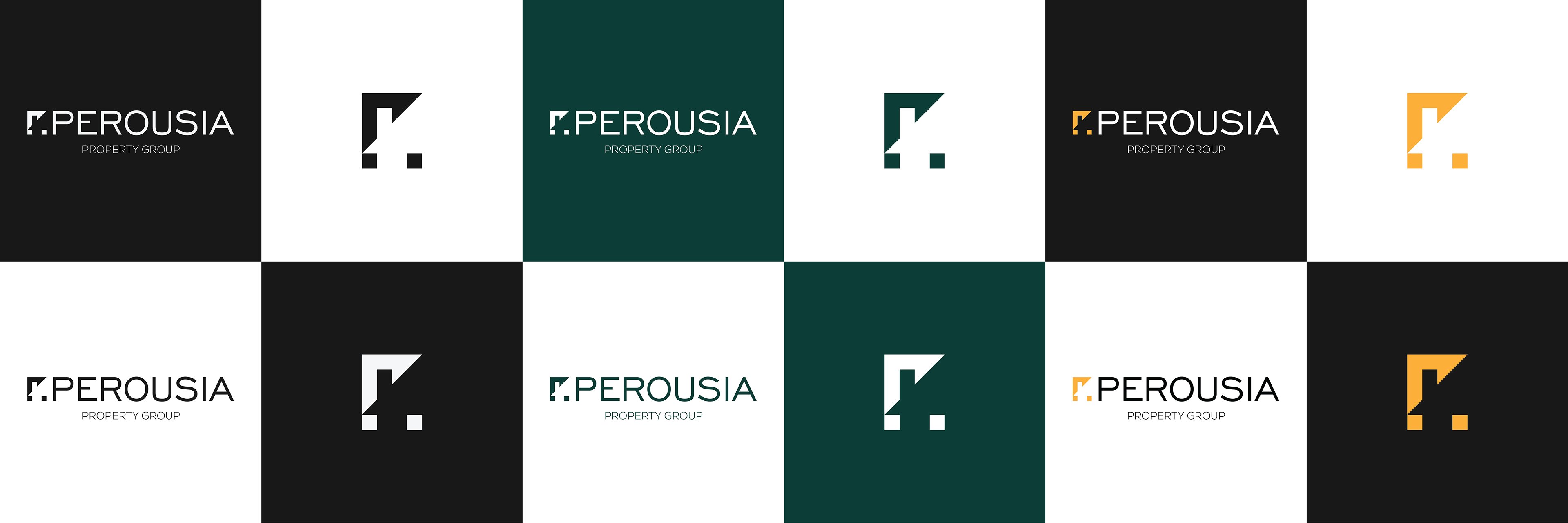
^^ Back to the drawing board! After some more sketching, these were the main candidates for the new design!
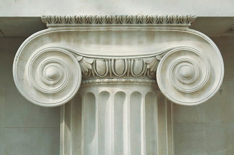
Based on the Ionic Pillars of Ancient Greece; they are tall, slender, and topped with their famous stone scrolls.

^^ Brand colours are extremely important in shaping how potential clients and customers see your brand.
A lot of the time, a client comes into the process with colour preferences. While these preferences are to be respected, we have to find the colours which best represent the brand's identity.
^^ Personally, I was a big fan of this Greek-style colour scheme, however the client felt that the more restrained Grey/White/Yellow colour scheme was more appropriate for their brand.
(In hindsight, I think they made the right choice!)
(っ◔◡◔)っ ❤
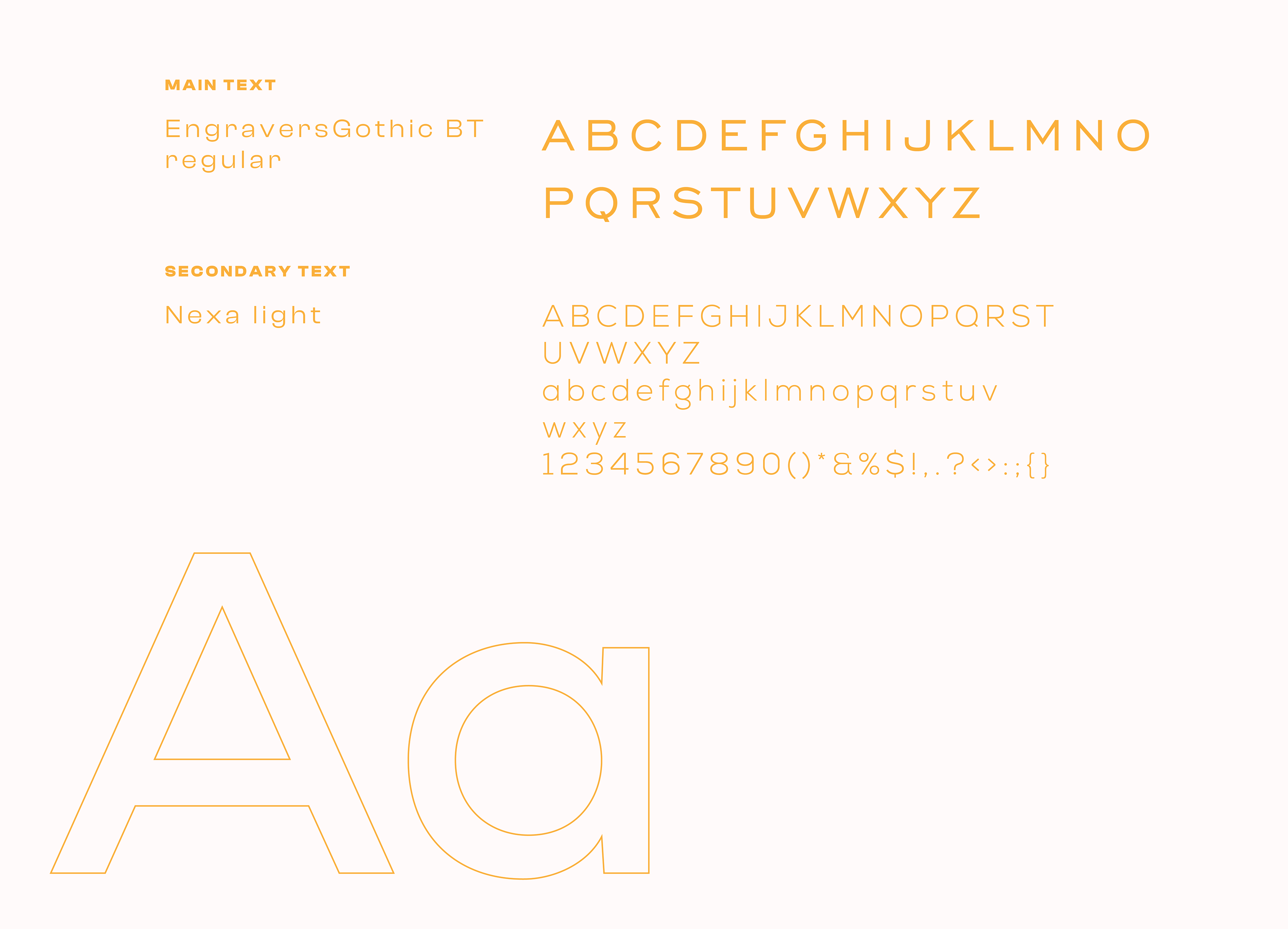
^^ Font choice is also an essential element of logo design and branding. For this brand we chose two strong but clean fonts to compliment the angular, geometric logo.

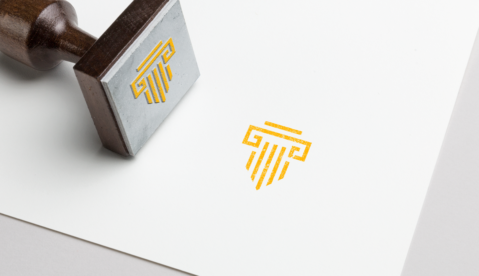
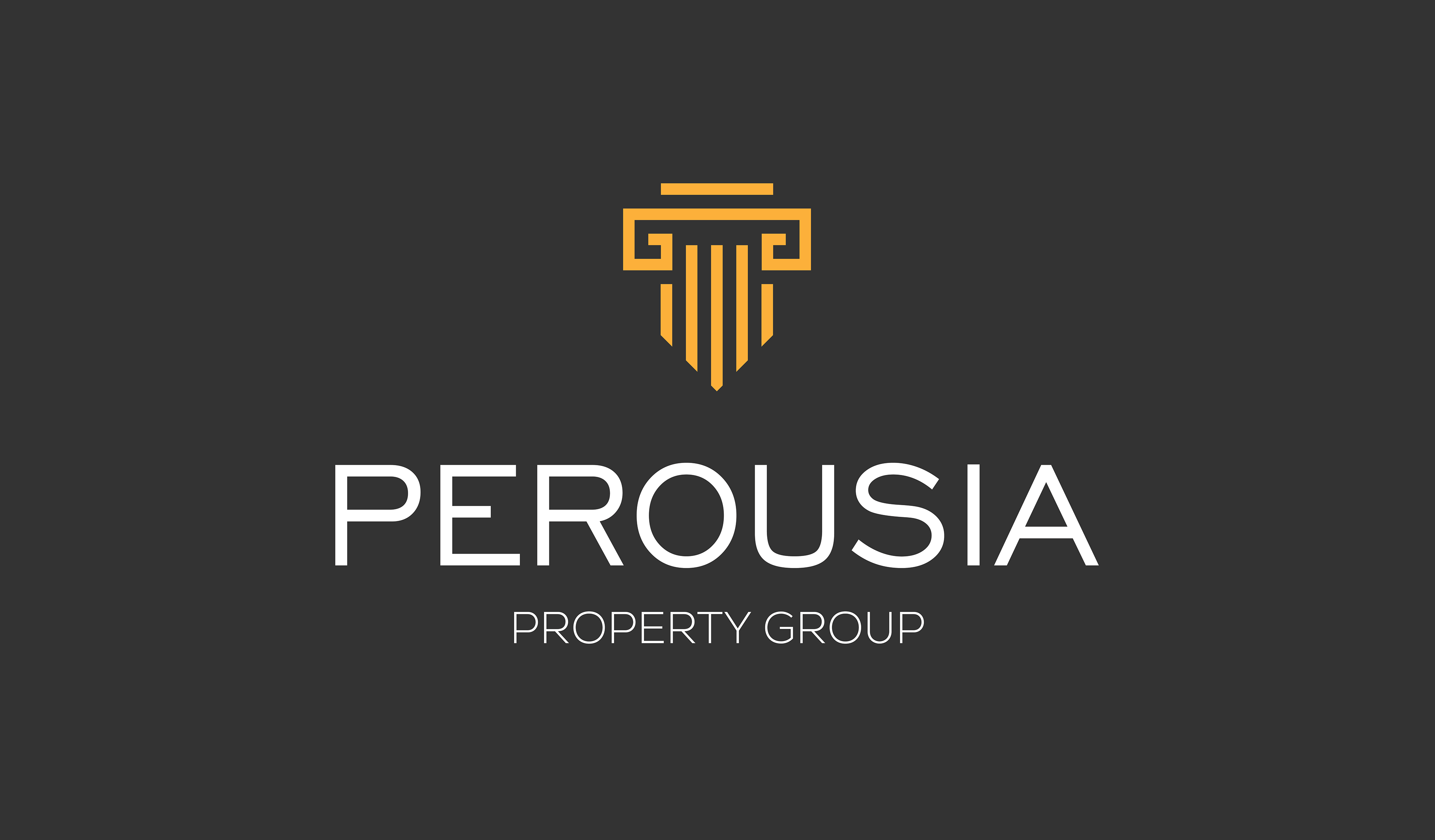
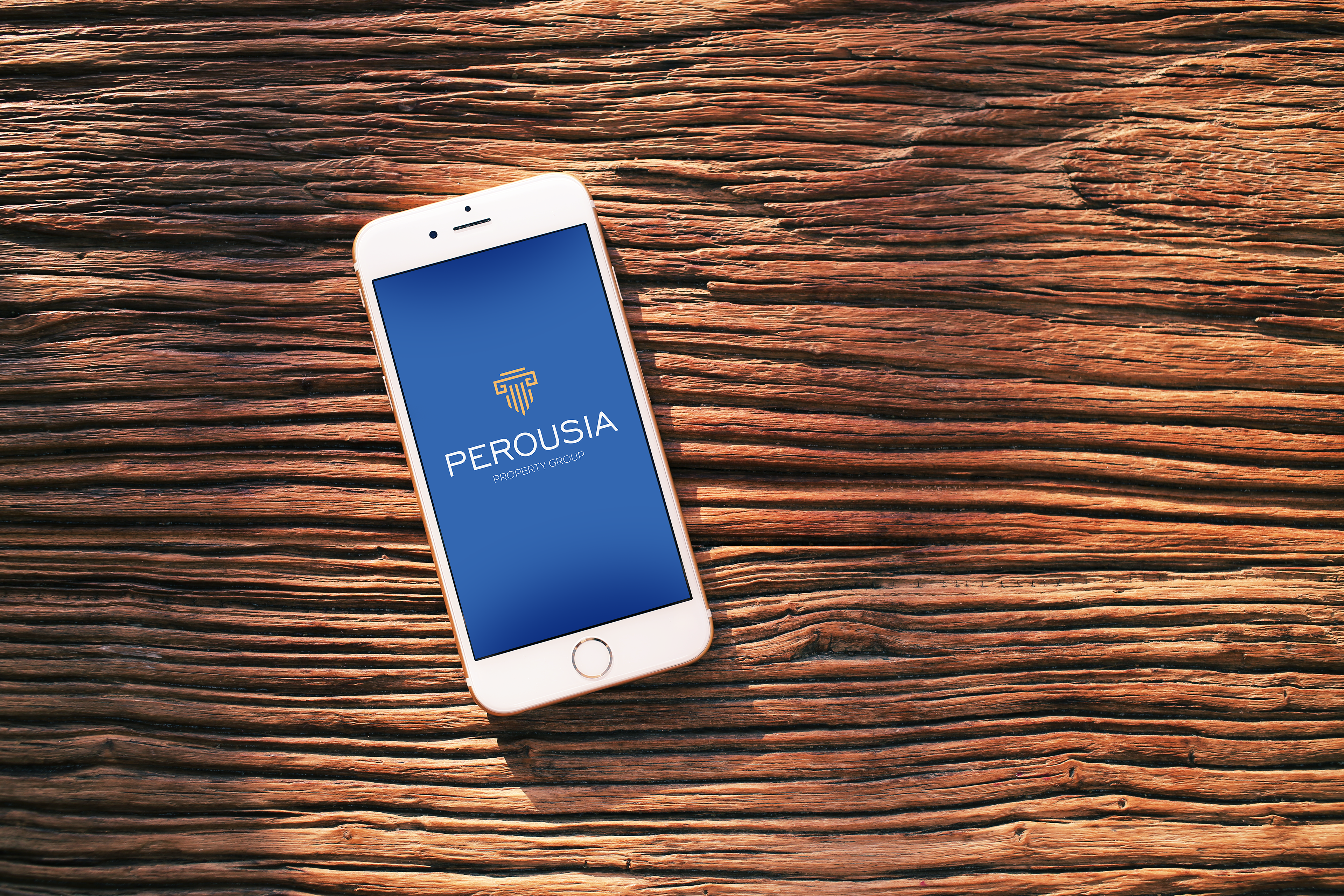
^^ All elements combined - the completed pillar logo, the powerful fonts, and the strong-but-subdued colour scheme.
^^ I'm extremely proud of this logo and excited to see it in action! Keep an eye out for more updates on the completed logo and the company it represents...
Long Live Perousia!
✌( ͡ᵔ ͜ʖ ͡ᵔ)